Getting Started

Welcome to the Northwell Health Digital Design Standards online library. The purpose of this guide is to document the Northwell Health digital design system, presenting a standardized display for elements, patterns, components, and pages. When applicable, component sections will provide usage text and code snippets. For extended developer support visit the Pattern Library. Please note that formatting for code snippets do not demonstrate indentation standards as they are the result after processing twig templates which include indentation for processing instructions. Any code snippets used should be reformatted as necessary.

Typography

TheSans Font
TheSans typeface is the font family for the Northwell Health design system. See more about TheSans on LucasFonts.
Text sizes and styles

Primary heading

37 (xs: 28)/1.16

Extra Light 200


Secondary heading

33 (xs: 24)/1.16

Extra Light 200


Tertiary heading

28 (xs: 20)/1.16

Extra Light 200


Quaternary heading

24 (xs: 18)/1.26

Extra Light 200


Quinary heading
20 (xs: 16)/1.26
Plain 500

Intro text
21 (xs: 16)/1.46
Extra Light 200

Body text
18 (xs: 14)/1.46
Extra Light 200

Typography specimens

The following typography examples show how headings, body text, tables, and other elements can be displayed together in a highly uniform, and easy-to-consume fashion.

Headings: Headings help to structure the content hierarchy of the page and should be ordered by their ranking. To avoid confusion, do not skip heading ranks.

Line length: For increased ease of readability, paragraph line length should be limited to 10 columns within the grid structure at large screens. On smaller screens, text can be displayed at full-width.

Italics: Italics should only be used when citing sources, and never used to style text as defined in the Northwell Health brand standards. Underlining should not be used when citing sources – or for any other text styling – as underlines are recognized as a convention when indicating a hyperlink on the Internet.

Primary heading

Lorem ipsum dolor sit amet, adipiscing elit. Ut nibh magna, efficitur et velit ut, pulvinar imperdiet augue. Suspendisse blandit, nunc sed ultricies condimentum, est mauris finibus risus, quis tristique leo turpis nec neque. Nulla congue lacinia pulvinar. Nullam pharetra lectus quis massa mattis hendrerit. Maecenas non magna orci. Donec congue blandit odio non bibendum. Mauris eget nunc tortor. Integer nec tortor imperdiet, posuere urna at, pharetra tortor. Sed diam elit, suscipit lobortis dolor quis, rutrum tincidunt ante. Interdum et malesuada fames ac ante ipsum primis in faucibus. Pellentesque ultrices vehicula tellus eget facilisis. Quisque iaculis metus tortor, eu pellentesque urna auctor quis. Integer vulputate lorem id nisi gravida, vitae vulputate lorem varius. Curabitur at placerat nibh.

Vivamus at lectus eu diam malesuada euismod. Quisque felis lacus, ullamcorper et urna non, posuere mattis est. Curabitur id aliquet odio, a nvallis lacus. Nulla vulputate nulla vel quam suscipit, at cursus nisi egestas. Vestibulum accumsan, neque sit amet pretium vehicula, sem ex dapibus est, sit amet semper leo erat in nisl. Suspendisse dignissim lorem sit amet ipsum fringilla scelerisque. Donec quis tellus vulputate, ornare felis congue, viverra massa. Praesent vitae est in urna cursus gravida. Proin et vulputate neque, et sagittis dui. Sed porta scelerisque enim, faucibus aliquet nisl ultrices et. Suspendisse in lobortis ipsum, non rhoncus tellus. Nullam eu turpis vitae neque auctor vehicula sit amet at ipsum.

Secondary heading

Vivamus in sapien vestibulum, venenatis massa quis, faucibus liberod mauris faucibus sem eget lacus Lorem ipsum dolor sit amet Praesent fringilla ante non
Volutpat laoreet sed id leo    
Duis tincidunt libero 29 0
Fermentum nulla 10 0
Nam at neque    
Curabitur maximus 66 22
Duis tincidunt libero nec 9 8
Pellentesque sit amet sem congue 16 8
Maecenas vestibulum dui non erat posuere    
Donec quis augue vel erat cursus placerat 132 43
A ultrices lorem eleifend. 21 1
Mauris faucibus sem eget lacus vehicula 19 7

Tertiary heading

  • This is a list item in an Unordered List
  • An unordered list is a list in which the sequence of items is not important. Sometimes, an unordered list is a bulleted list. And this is a long list item in an unordered list that can wrap onto a new line.
  • Lists can be nested inside of each other
    • This is a nested list item
    • This is another nested list item in an unordered list
  • This is the last list item
  1. This is a list item in an Ordered List
  2. An ordered list is a list in which the sequence of items is important. An ordered list does not necessarily contain sequence characters.
  3. Lists can be nested inside of each other
    1. This is a nested list item
    2. This is another nested list item in an ordered list
  4. This is the last list item
Quaternary heading
Quinary heading
Prisco DL, Sica AL, Talwar A, Narasimhan M, Omonuwa K, Hakimisefat B, Dedopoulos S, Shakir N, Greenberg H. “Correlation of pulmonary hypertension severity with metrics of comorbid sleep-disordered breathing.” Sleep Breath. 2011; 15[4] 633-9. [Epub ahead of print] PMID: 20927598
Kumar T, Epstein M, Markovskaya Y, Narasimhan M, Rosen M, Talwar A. “Bronchoscopy and Endobronchial disease in Patients with Human Immunodeficiency Virus Infection.” Indian J Chest Dis Allied Sci 2011;53:99-105 Read more
Singh AK, Patel N, Purvesh P, Leung K, Talwar A. “Manifestations of Pulmonary Disease in Adults with Congenital Heart Disease.” Indian J Chest Dis Allied Sci 2013;55:85-95
Reichert V, Folan P, Bartscherer D, Jacobsen D, Fardellone C, Egglinger A, Kohn N, Takatani M, Metz C, and Talwar A. “A Pilot Study to Examine the Effects of Smoking Cessation on Serum Markers of Inflammation in Women at Risk for Cardiovascular Disease.” Chest. 2009;136: 212-219

Colors

Primary colors

Primary colors make up the majority of hue usuage on the Northwell Health digital properties. NWH dark blue and NWH dark purple are the only colors allowed to be used as backgrounds behind reverse text. For usability concerns, primary hues should never be applied directly to typography, with the exception of links. NWH blue is the global link color, and can also be used for accents and rollovers, while NWH dark blue is the standard rollover color.

NWH dark blue

#003ca5

NWH blue

#009adf

NWH dark purple

#5c0b8a

Secondary colors

Secondary colors are to be used sparingly as accents, never as backgrounds behind reverse text, and never applied directly to type. NWH gold can be used as an indicator of an active interaction, as well as in separating rules between headings. When NWH gold is used in an interaction state, it should be applied as a 3px rule under the type, or around a form element.

NWH purple

#9f29b5

NWH gold

#ffba00

NWH orange

#ff681e

NWH green

#3dad2c

Neutral hues

When set in standard display over white, body type should use the darkest gray for ultimate readability and contrast. Headings can use the darker, or mid-shade hues depending on size and weight. All typography is required to comply with WCAG 2.0 contrast rules, never using light shades over white, or dark hues over background colors. To maintain a clean and fresh visual language, heavy neutral background colors should be avoided, using only the lightest gray in large backgrounds.

Darkest gray

#292929

Darker gray

#34383C

NWH gray

#53565a

Gray

#717376

Gray light

#cccccc

Gray lighter

#eaeaea

Gray lightest

#F7F7F7

Status colors

Status colors should never be used as accent colors, or as background colors. NWH red should be used in form errors, site status messages, or in limited type usage such as in "Closed now" wait time components. NWH dark green can only be used in wait time text when the location is marked as "Open now".

NWH red

#e33d2e

NWH dark green

#00823d

Additional colors

The light blue used here is not considered a new color, but rather a modified version of NWH blue at 43%. This version of the original color should only be used for navigation links in the footer, backgrounds in date boxes, site status message, and behind initials on a missing photo element in profiles.

Light blue

#bbeaff
43% lightened
NWH blue

Iconography

When inside a gallery component, photo and video images will be identified with a specific icon/color pairing and be placed in the upper right hand corner of the media image. When used with a photo, the camera icon will be set in reverse on a NWH green background. When used with a video, a video camera icon will be set in reverse on a NWH orange background. The smaller version of the lockup will appear in the gallery pager list. In addition to display inside a gallery, video media can use the identifying icon/color pairing when used in article cards.


Article cards

Article cards should only be used to display content such as news, events, press releases, or videos as part of stories. Other types of content that use the article card format are locations, and location wait times.

Unless otherwise noted for specific usage, recommended character limits are 80 or less for titles, and 140 or less for summaries.

Standard version
Image Alt
Autem ab unde vel possimus ipsam deleniti. Aut sed et maxime vitae. Dolores illo non commodi fuga id officiis.
Taxonomy label
Stacked version

When displaying as a stacked version, it is recommended to omit the taxonomy section due to space constraints. When possible, showing only title and summary will provide for the cleanest display.

Autem ab unde vel possimus ipsam deleniti. Aut sed et maxime vitae. Dolores illo non commodi fuga id officiis.
Stacked version with video media
Autem ab unde vel possimus ipsam deleniti. Aut sed et maxime vitae. Dolores illo non commodi fuga id officiis.
Stacked small version
Autem ab unde vel possimus ipsam deleniti. Aut sed et maxime vitae. Dolores illo non commodi fuga id officiis.
Content/results version
Image Alt
Autem ab unde vel possimus ipsam deleniti. Aut sed et maxime vitae. Dolores illo non commodi fuga id officiis.
vel iste soluta
Long Island Jewish Medical Center
Autem ab unde vel possimus ipsam deleniti. Aut sed et maxime vitae. Dolores illo non commodi fuga id officiis.
270-05 76th AvenueNew Hyde Park, NY 11040
Our Preparation for Childbirth Class prepares expecting parents for the birthing experience. Northwell Health Nurse Educators discus the process of labor and birth.
Autem ab unde vel possimus ipsam deleniti. Aut sed et maxime vitae. Dolores illo non commodi fuga id officiis.
Innovation at Northwell
Autem ab unde vel possimus ipsam deleniti. Aut sed et maxime vitae. Dolores illo non commodi fuga id officiis.
Call to action
Wait time version

Recommended character limits are 50 or less for area names, and 90 or less for location names.

Wait time block

The recommended character limit for the location name is 90 characters or less. The Wait times block is JavaScript-driven, grabbing a specific facility via its ID in the data-ref attribute e.g. with GC for Glen Cove Hospital below. Once the data is retrieved, the Wait time block's title will update to the specified facility. To loop through all facilities use data-ref="all".

Content promo cards

Content promo cards can be used to promote sections or pages within the site, provide contact information, or for displaying standalone content such as quotes. When using narrative block versions, the card can be paired with a component such as a gallery or grid of cards to tie together the grouping in one encapsulated area.

Unless otherwise noted for specific usage, recommended character limits are 80 or less for titles, and 140 or less for summaries.

Standard version
Image Alt
Similique atque autem quia deleniti rerum ut. Nihil maiores aut ea.
Autem ab unde vel possimus ipsam deleniti. Aut sed et maxime vitae. Dolores illo non commodi fuga id officiis.
Learn more now
Image Alt
Similique atque autem quia deleniti rerum ut. Nihil maiores aut ea.
Autem ab unde vel possimus ipsam deleniti. Aut sed et maxime vitae. Dolores illo non commodi fuga id officiis.
Call to action
Stacked version
Consectetur quas non qui est. Quae et culpa eveniet odio expedita. Sed hic temporibus minus.
Voluptatibus in pariatur ab sunt cum. Non quia et adipisci et sequi asperiores mollitia. Vitae odit dolores optio qui. Qui unde recusandae non et.
Call to action
Similique atque autem quia deleniti rerum ut. Nihil maiores aut ea.
Autem ab unde vel possimus ipsam deleniti. Aut sed et maxime vitae. Dolores illo non commodi fuga id officiis.
Learn more now
Available colors for accents

NWH gold

NWH dark blue

NWH blue

NWH dark purple

NWH purple
Stacked with background color
Factoid version

The recommended character limit for the alphanumeric title is 8 or less

Developer note: When multiple clipped edge cards are in a group, only the first item should show the clipped edge. By placing the ".card-group" class on the wrapper, it will do this automatically.

Narrative version

Narrative versions of a card are used to separate and act as anchor areas when paired with the landing anchor nav. This version of a card can be used as standalone element with accompanying media and call to action, or it can be used to preface a grid of cards or components such as gallery or timeline.

The recommended character limit for the narrative heading (quinary above the line) is 30 or less.

Similique atque autem quia deleniti rerum ut. Nihil maiores aut ea.

Narrative lock-up large heading

Autem ab unde vel possimus ipsam deleniti. Aut sed et maxime vitae. Dolores illo non commodi fuga id officiis.
Call to action
Similique atque autem quia deleniti rerum ut. Nihil maiores aut ea.

Narrative lock-up large heading with no image

Autem ab unde vel possimus ipsam deleniti. Aut sed et maxime vitae. Dolores illo non commodi fuga id officiis.
Contact version

Contact versions can use any of the available defined accent colors for stacked cards.

Call for an appointment
Autem ab unde vel possimus ipsam deleniti. Aut sed et maxime vitae. Dolores illo non commodi fuga id officiis.
Make an appointment online
Publication version

Publication cards are the only exception to the global 7x5 image ratio, allowing for the specific needs of the print-media portrait ratio.

Always in Motion
Read the latest issue of Always in Motion, the publication of the Northwell Health Rehabilitation Network.
View full publication
Quote version

Quote versions can use any of the available defined accent colors for stacked cards.

The recommended character limit for quote text is 200 or less.

"Voluptatibus in pariatur ab sunt cum. Non quia et adipisci et sequi asperiores mollitia. Vitae odit dolores optio qui. Qui unde recusandae non et."
–John J Ipsum

Contact promo cards

Contact promo cards can be used to provide contact information.

Unless otherwise noted for specific usage, recommended character limits are 80 or less for titles, and 140 or less for summaries.

Contact variation
Day Hours
Monday 2:00pm-3:00pm
Tuesday 2:00pm-3:00pm
Wednesday 2:00pm-3:00pm
Thursday 2:00pm-3:00pm
Friday 2:00pm-3:00pm
Saturday Closed
Sunday Closed
Make an appointment online
Contact variation
Day Hours
Monday 2:00pm-3:00pm
Tuesday 2:00pm-3:00pm
Wednesday 2:00pm-3:00pm
Thursday 2:00pm-3:00pm
Friday 2:00pm-3:00pm
Saturday Closed
Sunday Closed
Make an appointment online
Contact variation
Call for hours.
Contact variation
Contact variation
136 E Jericho Turnpike, Room 400Mineola, NY 11501
Day Hours
Monday 2:00pm-3:00pm
Tuesday 2:00pm-3:00pm
Wednesday 2:00pm-3:00pm
Thursday 2:00pm-3:00pm
Friday 2:00pm-3:00pm
Saturday Closed
Sunday Closed
Make an appointment online
Contact variation
Call for hours.
Contact variation
Call for hours.
136 E Jericho Turnpike, Room 400Mineola, NY 11501
Contact variation
Contact variation
Call for hours.
136 E Jericho Turnpike, Room 400Mineola, NY 11501
Make an appointment online
Contact variation
136 E Jericho Turnpike, Room 400Mineola, NY 11501

Event cards

Single event version
Event
Consectetur quas non qui est. Quae et culpa eveniet odio expedita. Sed hic temporibus minus.
Autem ab unde vel possimus ipsam deleniti. Aut sed et maxime vitae. Dolores illo non commodi fuga id officiis.
North Shore University Hospital
300 Community Drive., Manhasset, NY 11040
Register on Eventbrite
Event listing version
Autem ab unde vel possimus ipsam deleniti. Aut sed et maxime vitae. Dolores illo non commodi fuga id officiis.
vel iste soluta
Stacked event version
Autem ab unde vel possimus ipsam deleniti. Aut sed et maxime vitae. Dolores illo non commodi fuga id officiis.
Stacked event right rail version
Similique atque autem quia deleniti rerum ut. Nihil maiores aut ea.
Autem ab unde vel possimus ipsam deleniti. Aut sed et maxime vitae. Dolores illo non commodi fuga id officiis.
Register on Eventbrite

Block quote

The recommended character limit for quote text is 200 or less.

"Voluptatibus in pariatur ab sunt cum. Non quia et adipisci et sequi asperiores mollitia. Vitae odit dolores optio qui. Qui unde recusandae non et."

Maps

Full width version

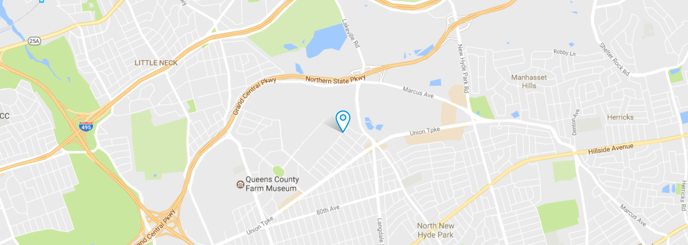
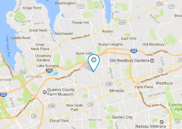
Full width maps must always be placed in the bottom of a location page, directly on top of the footer.

Profile

Profile Hero

There is no limit to the amount of characters that can be displayed in a name. The design has been optimized to allow for longer names when increased characters are needed. The recommended character limit for specialties is 100 or less.

profile image for Lauren Ipsum, MD

Lauren Ipsum, MD

  • Languages spoken: English, Hindi, Marathi
  • Gender: Female
Specialties
Medical Oncology, Hemamtology, Internal Medicine, Specialty Name
Profile results

The recommended character limit for specialties is 100 or less.

alt text for professional
Accepting new patients

Adolescent Medicine, Pediatrics

Patient satisfaction
4.8 out of 5 rating
Accepting new patients

Adolescent Medicine, Pediatrics

Patient satisfaction
4.7 out of 5 rating

Gastroenterology, Geriatric Medicine, Internal Medicine

450 Lakeville RoadLake Success, NY 11040
Patient satisfaction Reviews not available
Profile Card

Michael Dowling

President and CEO, Northwell Health


Ralph Nappi

Executive Vice Chair, Board of Trustees, Northwell Health

more titles can expand here

Specialties: Pediatric Hematology/Oncology, Pediatrics

Media with caption

The recommended character limit for caption text is 140 or less.

Image Alt
Voluptatibus in pariatur ab sunt cum. Non quia et adipisci et sequi asperiores mollitia. Vitae odit dolores optio qui. Qui unde recusandae non et.

Hero

Hero components, with the exception of the full width version, are only allowed to be placed directly at the top of a page. See the pages section of the style guide for specific usage.

The recommended character limits are 80 or less for titles, and 140 or less for summaries.

Default version

The default display for the hero, this version should be used for location pages where the hero sits underneath the page header.

Hero Image Alt
Similique atque autem quia deleniti rerum ut. Nihil maiores aut ea.
Autem ab unde vel possimus ipsam deleniti. Aut sed et maxime vitae. Dolores illo non commodi fuga id officiis.
Call to action
White version

Hero components with white backgrounds should only be used on top level, and campaign landing pages. To achieve the correct balance of color, the hero should be followed by a component, or components that introduce elements of color. Examples are the landing page sticky nav, tab bar, content card groups with background color, or other components that provide an elevated usage of vibrant hues.

Hero Image Alt
Similique atque autem quia deleniti rerum ut. Nihil maiores aut ea.
Autem ab unde vel possimus ipsam deleniti. Aut sed et maxime vitae. Dolores illo non commodi fuga id officiis.
Call to action
White version with scroll arrow
Hero Image Alt
Similique atque autem quia deleniti rerum ut. Nihil maiores aut ea.
Autem ab unde vel possimus ipsam deleniti. Aut sed et maxime vitae. Dolores illo non commodi fuga id officiis.
Call to action
Dark blue version
Dark purple version
Hero Image Alt
Similique atque autem quia deleniti rerum ut. Nihil maiores aut ea.
Autem ab unde vel possimus ipsam deleniti. Aut sed et maxime vitae. Dolores illo non commodi fuga id officiis.
Call to action
Full width version
Hero Image Alt
Similique atque autem quia deleniti rerum ut. Nihil maiores aut ea.
Voluptatibus in pariatur ab sunt cum. Non quia et adipisci et sequi asperiores mollitia. Vitae odit dolores optio qui. Qui unde recusandae non et.
Play video for Voluptatibus in pariatur ab sunt cum. Non quia et adipisci et sequi asperiores mollitia. Vitae odit dolores optio qui. Qui unde recusandae non et.
Image right version
Hero Image Alt
Similique atque autem quia deleniti rerum ut. Nihil maiores aut ea.
Autem ab unde vel possimus ipsam deleniti. Aut sed et maxime vitae. Dolores illo non commodi fuga id officiis.
Call to action

Content Lists

The recommended character limit for content list titles is 80 or less, and 140 or less for summaries.
Multiple column (3-column)
Content list grouping title
Autem ab unde vel possimus ipsam deleniti. Aut sed et maxime vitae. Dolores illo non commodi fuga id officiis.
Image Alt
Autem ab unde vel possimus ipsam deleniti. Aut sed et maxime vitae. Dolores illo non commodi fuga id officiis.
View morearticles
Multiple column (4-column)
Content list grouping title
Autem ab unde vel possimus ipsam deleniti. Aut sed et maxime vitae. Dolores illo non commodi fuga id officiis.
View morearticles
Featured item with list

This component holds four items. One featured item on the left, and three additional items on the right.

Content list grouping title test
Autem ab unde vel possimus ipsam deleniti. Aut sed et maxime vitae. Dolores illo non commodi fuga id officiis.
View more

Timeline

1995 2000

1991

Two nullam sagittis. Nullam tincidunt adipiscing enim. Praesent nec nisl a purus blandit viverra. Ut non enim eleifend felis pretium feugiat.
Read More

1992

Three adipiscing nullam tincidunt enim. Nullam sagittis. Praesent nec nisl a purus blandit viverra. Ut non enim eleifend felis pretium feugiat.
Call to action

1993

Four praesent nec nisl a purus blandit viverra. Ut non enim eleifend felis pretium feugiat. Nullam tincidunt adipiscing enim. Nullam sagittis.
Call to action

1994

Five ut non enim eleifend felis pretium feugiat. Nullam tincidunt adipiscing enim. Nullam sagittis. Praesent nec nisl a purus blandit viverra.
Call to action

1995

Six nullam tincidunt adipiscing enim. Nullam sagittis. Praesent nec nisl a purus blandit viverra. Ut non enim eleifend felis pretium feugiat.
Call to action

1996

Seven nullam sagittis. Nullam tincidunt adipiscing enim. Praesent nec nisl a purus blandit viverra. Ut non enim eleifend felis pretium feugiat.
Call to action

1997

Eight adipiscing nullam tincidunt enim. Nullam sagittis. Praesent nec nisl a purus blandit viverra. Ut non enim eleifend felis pretium feugiat.
Call to action

1998

Nine praesent nec nisl a purus blandit viverra. Ut non enim eleifend felis pretium feugiat. Nullam tincidunt adipiscing enim. Nullam sagittis.
Call to action

1999

Ten ut non enim eleifend felis pretium feugiat. Nullam tincidunt adipiscing enim. Nullam sagittis. Praesent nec nisl a purus blandit viverra.
Call to action

2000

Eleven nullam tincidunt adipiscing enim. Nullam sagittis. Praesent nec nisl a purus blandit viverra. Ut non enim eleifend felis pretium feugiat.
Call to action

2001

Twelve ut non enim eleifend felis pretium feugiat. Nullam tincidunt adipiscing enim. Nullam sagittis. Praesent nec nisl a purus blandit viverra.
Call to action

2002

Thirteen nullam sagittis. Nullam tincidunt adipiscing enim. Praesent nec nisl a purus blandit viverra. Ut non enim eleifend felis pretium feugiat.
Call to action

2003

Fourteen adipiscing nullam tincidunt enim. Nullam sagittis. Praesent nec nisl a purus blandit viverra. Ut non enim eleifend felis pretium feugiat.
Call to action

2004

Fifteen praesent nec nisl a purus blandit viverra. Ut non enim eleifend felis pretium feugiat. Nullam tincidunt adipiscing enim. Nullam sagittis.
Call to action

Tabs

The recommended maximum amount of tabs that can be displayed is 8, with no more than 110 characters in total across all the tab titles. Characters in excess of these amounts could cause wrapping of the items.
Contained tabs
Image Alt
Autem ab unde vel possimus ipsam deleniti. Aut sed et maxime vitae. Dolores illo non commodi fuga id officiis.
Taxonomy label
Image Alt
Similique atque autem quia deleniti rerum ut. Nihil maiores aut ea.
Autem ab unde vel possimus ipsam deleniti. Aut sed et maxime vitae. Dolores illo non commodi fuga id officiis.
Call to action
Full width tabs
Hero Image Alt
Similique atque autem quia deleniti rerum ut. Nihil maiores aut ea.
Autem ab unde vel possimus ipsam deleniti. Aut sed et maxime vitae. Dolores illo non commodi fuga id officiis.
Call to action
Image Alt
Autem ab unde vel possimus ipsam deleniti. Aut sed et maxime vitae. Dolores illo non commodi fuga id officiis.
Taxonomy label
Image Alt
Similique atque autem quia deleniti rerum ut. Nihil maiores aut ea.
Autem ab unde vel possimus ipsam deleniti. Aut sed et maxime vitae. Dolores illo non commodi fuga id officiis.
Call to action
Full width container fluid tabs
Hero Image Alt
Similique atque autem quia deleniti rerum ut. Nihil maiores aut ea.
Autem ab unde vel possimus ipsam deleniti. Aut sed et maxime vitae. Dolores illo non commodi fuga id officiis.
Call to action
Image Alt
Autem ab unde vel possimus ipsam deleniti. Aut sed et maxime vitae. Dolores illo non commodi fuga id officiis.
Taxonomy label
Image Alt
Similique atque autem quia deleniti rerum ut. Nihil maiores aut ea.
Autem ab unde vel possimus ipsam deleniti. Aut sed et maxime vitae. Dolores illo non commodi fuga id officiis.
Call to action

Forms

Field label and input placeholder text should not exceed 40 characters. For error text, the recommended character limit is 110 or less. If required, form error messages can be increased to 170 characters, but it will add additional space between form rows. When creating error messages, they should be descriptive and actionable. They should not be a general message such as “Error”, or a repeat of the original field label.
Lorem ipsum dolor sit amet, consectetur adipiscing elit. Maecenas consectetur eros.
Assumenda qui ratione officiis. Maxime nisi sapiente nulla velit voluptas
Consectetur quas non qui est. Quae et culpa eveniet odio expedita. Sed hic temporibus minus.

Pagination

Full size
Mobile
Alphabetic
@atoms/styleguide-pagination--alpha.twig

Modal dialog

Basic example

Video modal example

Infographic example

Limelight video modal example

Article summary

Limelight video modal example

Site header

Homepage version

The main Northwell.edu property will use NWH blue as the site's identifying color. The identifying color will be used in the background of the primary navigation bar on the homepage, and in page header backgrounds on internal pages. To view full interaction and code snippet for this version, click here to see the site header organism.


Dark blue version

NWH dark blue is another example of an identifying color that can be used for a Northwell digital property. To view full interaction and code snippet for this version, click here to see the site header organism.


Dark purple version

NWH dark purple is another example of an identifying color that can be used for a Northwell digital property. To view full interaction and code snippet for this version, click here to see the site header organism.


Interior version

For all Northwell web properties on internal pages, the interior header variation should be used. This version contains a compressed logo, and the lightest gray hue as the background behind the primary nav. To view full interaction and code snippet for this version, click here to see the site header organism.


Micro site headers

Micro site header home version

On the home of the micro site, the hospital’s logo will display in the header and link back to the hospital's homepage. The Northwell.edu link will show in the utility navigation. To view full interaction and code snippet for this version, click here to see the site header organism.


Micro site header interior version

For all micro site internal pages, the interior header variation should be used. This version contains a compressed logo, and the lightest gray hue as the background behind the primary nav. To view full interaction and code snippet for this version, click here to see the site header organism.


Nested site header

Home version

On the home of the nested site, the site's title becomes a header and is not a link. To view full interaction and code snippet for this version, click here to see the nested site header organism.


Interior version

Within the interior of a nested site, the site's title is plain text maintaining the appearance of a header and links back to its home. To view full interaction and code snippet for this version, click here to see the nested site header organism.


Navigation

Utility navigation
Main navigation
Sibling navigation
Anchor navigation
Landing anchor navigation

Page header

Page headers should only be used for location-type pages, search pages, or when an article 28 distinction sub-heading is required.

The recommended character limit for page header titles is 40 or less, and 60 or less for sub-headings.

Default version
All options shown

Status messages

Because status messages are often generated by the backend, there is no strict character limit. When possible, it is suggested to keep characters within 100 or less to avoid line wrapping. Status messages should be descriptive and actionable. They should avoid medical or technical jargon.


Page examples

Top level/campaign landing pages

Hero component usage

Hero components with white backgrounds should only be used on top level, and campaign landing pages. To achieve the correct balance of color, the hero should be followed by a component, or components that introduce elements of color. Examples are the landing page sticky nav, tab bar, content card groups with background color, or other components that provide an elevated usage of vibrant hues.

Sticky nav and narrative block usage

The gray bar/constellation sticky nav bar should only be used on top level, and campaign landing pages. When using the nav, narrative blocks will act as the anchored areas throughout the page.

Location page

Most location pages will have an address associated with them, but it's not a requirement to use the location template. The top portion should always contain a page header, which can include an optional address, phone number, fax number, or an article 28 sub-heading.

Hero component usage

If a hero component is used, it must be the default gray version.

Map

When displaying a map on a location page, it must always be placed in the bottom of the page, directly on top of the footer.

Interior child page

Anchor nav usage

The anchor navigation sidebar should only be used on internal pages when there is a need to jump to content within the page.

Full width component usage

On interior pages with anchor navigation, full width components (full width hero, full width tab bar) cannot be placed inside the main content well because of the constraints set by the grid system to accommodate the left navigation. Full width components can be placed at the bottom of the page in a designated area, which is outside of the grid system.

Nested site pages